 The Unofficial 7-Eleven Speak Out Wireless Canada Consumer Page
 Facebook
 Twitter
 Email this
 Log In
 Register
 Home
Home

 Topic RSS

9:36 pm
March 31, 2007
 Offline


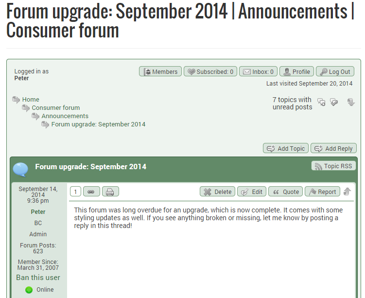
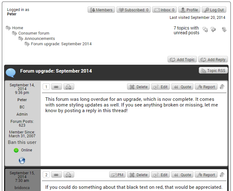
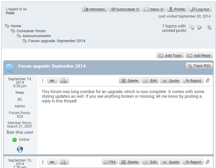
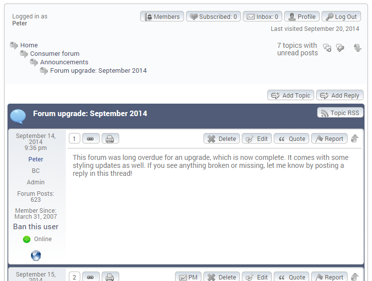
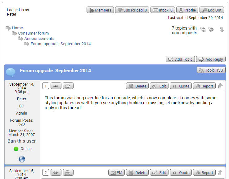
This forum was long overdue for an upgrade, which is now complete. It comes with some styling updates as well. If you see anything broken or missing, let me know by posting a reply in this thread!
7:30 am
April 22, 2009
Offline
If you could do something about that black text on red, that would be appreciated.
2:24 pm
October 14, 2008
Offline
I agree. Kind of hard on the eyes ![]()
3:11 pm
March 31, 2007
Offline
Are you referring just to the buttons? The text itself should just be black on white.
4:56 pm
April 22, 2009
Offline
I think the gradients on the red buttons are the problem, A more neutral, and solid colour could make a better button. I cannot really say what would be better, it is one of those I know what I hate sort of things, I guess! ![]()
Than again, the text on the solid red seems to look fine, maybe I have a problem with the gradient, and not the colour.
11:33 pm
January 18, 2009
Offline

Yes, the buttons with black text. I get nauseous looking at them. If its only me then I guess I live with it. Why red anyway? Blue seems pretty standard on forums and it is easy on the eyes. Looking at the red gets my BP up a notch or two and my quintuple bypass might not last as long as it is supposed to!! ![]()
8:11 am
March 31, 2007
Offline
I've switched it now to "minimalist". If it's too much white, there are a couple of blue themes we can try.
7:33 pm
April 22, 2009
Offline
It is an improvement, but it would be nice to see the other choices.
I noticed, as an administrator, I can delete a topic, but not a post. Am I missing something?
The toolset icon is hidden, but I can deal with that.
9:30 pm
December 30, 2010
Offline
unfortunately, i can't bear it for more than 5 minutes so adios speakout community
11:45 pm
January 18, 2009
Offline
Thanks for listening and trying. This is an improvement but perhaps a blue would keep chimpanzee here.
7:33 am
May 2, 2009
Offline
Peter said
I've switched it now to "minimalist". If it's too much white, there are a couple of blue themes we can try.
Seems a bit too white now. Perhaps another theme that frames the postings a bit more distinctly? But, whatever you select will be fine with me.
One other thing I noticed... I always go to the "latest postings" section, but that list does not have the same detail that it used to, for example showing the number of pages.
11:03 am
March 31, 2007
Offline
Thanks for all your feedback so far. I've changed it to one of the many blue themes now. Here are some other options:
Green
Gray (I like this one, but it has a really dark alternate shaded background as you can partially see; I could always override it if the rest of the theme is acceptable)
Blue 1
Blue 2
Blue 3 (the current one)
Blue 4
(There was at least someone who liked the minimalist theme, so who knows, maybe we'll end up back with that again.)
I'm also not a fan with the new "latest postings" section. The problem is, I had custom written the old one with the table-like display, and none of that code is valid anymore ![]() . So, it's possible, but will be a bit of a challenge.
. So, it's possible, but will be a bit of a challenge.
1:32 pm
April 22, 2009
Offline
Blue 3 is a nice choice. Other than Blue 4, the other choices are decent also. But even Blue 4 is better than the last 2 themes. Everything is readable, and the colors don't cause my eyes to bleed! The White minimalist theme was passable, at least compared to the previous theme. That theme should have been named Tampex Red!
6:10 pm
October 14, 2008
Offline
Blue 3 or Blue 4 is ok with me. I really wanted plaid, but I guess that's just not doable ![]()
12:12 pm
January 18, 2009
Offline
green, blue 3 or 4 or as is.
Did we not used to go to the latest post when looking at recent posts. with chrome I seem to go to the first post in the thread. No big deal.
1:02 pm
March 31, 2007
Offline
dennismiller said
Did we not used to go to the latest post when looking at recent posts. with chrome I seem to go to the first post in the thread. No big deal.
This is a bit obscure, but if you click on the arrow underneath the thread title, that goes to the latest post.
